
I pulled 1,036 LinkedIn posts from 94 accounts active in or around Jersey's financial services market.
Trust companies. Fund administrators. Fiduciary firms. Family offices. Law firms. Accounting firms. The original 28 firms from my Digital Presence Report are in there, alongside a set of global parents, networks and competitors a Jersey buyer would recognise.
This is a study about company pages, the logo accounts, not people's own profiles. That was a deliberate choice. They're how a firm looks legitimate and active, the most common entry point, and a lower-risk place to start than posting as yourself.
Where the report does look at personal profiles it says so, and treats what it finds as a signal rather than a verdict. A proper personal-profile study is the next one, and for some, that's where the biggest opportunity lies.
What actually works here
Most LinkedIn advice aimed at this sector is still thin: post consistently, add value, use carousels, comment more, get your hashtags and timing right. It could have been written for any market, anywhere.
I've also been testing the answers on myself. One of those posts got seen by over 25,000 people, with LinkedIn pushing most of it well beyond my own network. My first genuinely viral one.
So what follows isn't just theory. (It's also what led me to build something specifically for firms in this spot, which I'll come back to.)
What this report measures
When an agency or an in-house team sells a firm on LinkedIn, the promise is usually brand awareness. I can't see impressions directly, but engagement is the best outside read on them. As engagement goes up, so does brand awareness.
That isn't the same as winning clients, and this report doesn't pretend otherwise. Conversion has to be measured firm by firm, so it sits outside this scope. Engagement is the piece this report measures.
Contributor insight from
The shape of the feed: unequal, not dead
The first surprise was how much is going on. Posting a lot is more common than not posting at all, and on the surface there seems to be plenty of engagement: the typical post earns 27 reactions, and fewer than one in a hundred earns nothing at all.
In my experience most firms and agencies treat LinkedIn as a box-ticking exercise, so that surprised me at first. People do turn out.
Then I looked closer, at better measures of engagement, and it changed the picture. The turnout is real, but it doesn't spread evenly.
The same insight, from the same firm, in the same week, can earn 12 reactions or 200 depending on who publishes it and how. Across the 46 firms with enough posts to measure, the top fifth of posts carry roughly 45% of all engagement, against the 20% an even spread would give.
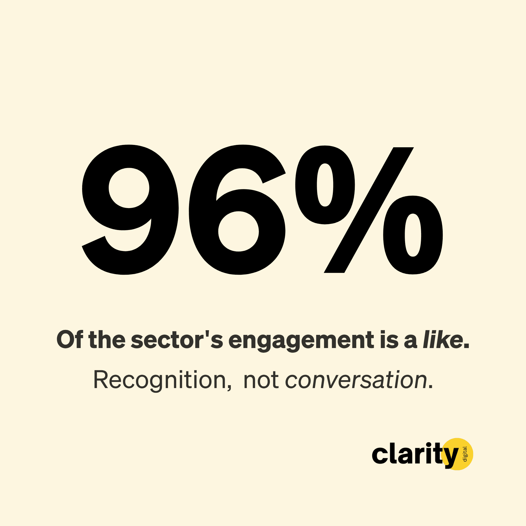
The attention that does turn up is also thin. Comments make up under 4% of all engagement; the other 96% is a like. The median post earns 27 likes and zero comments.
Of every reaction in the sample, 89% are a plain "like". "Insight", the reaction that means a post actually made someone think, is just 1%. Several of the largest accounts, six-figure followings included, recorded effectively zero comments across every post observed.
Earn the reply
There's an opening hiding in that. If almost every reaction is a passive like, a post that earns a genuine comment is doing something rare, and comments are where a conversation, and often a relationship, starts.
So here's a north star worth holding onto: earn the reply. Not by bolting a lazy "thoughts? 👇" onto the end, but by writing something a real person actually wants to respond to. Almost no one here is clearing that bar, which is exactly why it's worth aiming at.
So the feed isn't dead, but it's uneven, mostly passive, and far more sensitive to how a post is packaged than to what's in it. The rest of the report takes that apart.
Finding 1: The followers trap
Set a Jersey trust company beside a global brand and the gap isn't the one everyone assumes.
| Firm | Followers | Median engagement | Engagement rate |
|---|---|---|---|
| Global brand 1 | ~5.9M | 342 | 0.006% |
| Global brand 2 | ~710k | 60 | 0.008% |
| Global brand 3 | ~195k | 20 | 0.011% |
| Global brand 4 | ~190k | 144 | 0.076% |
| - | - | - | - |
| Jersey firm A | ~640 | 24 | 3.82% |
| Jersey firm B | ~480 | 16 | 3.25% |
| Jersey firm C | ~630 | 20 | 3.08% |
| Jersey firm D | 1,591 | 53 | 3.33% |
| Jersey firm E | 1,593 | 75 | 4.71% |
Raw engagement does rise with followers. The big brands earn more total reactions than any small Jersey firm will, and that's a fair point to make.
The trap is treating the follower count as the asset. The largest accounts here convert around one-hundredth of one percent of their followers on a typical post. The smallest, best-run firms convert three to five percent.
That difference is partly mechanical, because the large denominator is full of weak follows. But it's still useful. It tells you that a small page with a concentrated audience isn't a consolation prize.
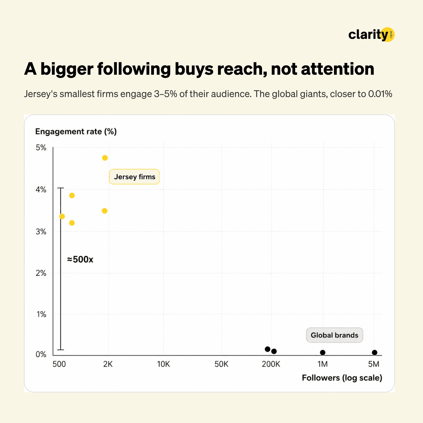
Being small works in your favour
So stop treating follower count as the scoreboard. And notice what the numbers are really saying: on this platform, being small works in your favour.
Most channels reward scale; per follower, this one rewards a warm, concentrated audience. A small, warm LinkedIn following is a valuable asset if it can create business outcomes.
A 600-follower Jersey firm shouldn't be embarrassed by the size of its page if a meaningful share of that audience reacts when it posts. A large firm should be more worried than it usually is if its huge audience barely moves.
The raw numbers will always favour the big brands. Those huge accounts are almost certainly spending orders of magnitude more than a small Jersey firm on marketing, events and business development every month, for a response rate near zero.
Efficiency is the game that actually matters, in both engagement rate and cost. For a small firm, one or two extra clients can be life-changing; for a giant, far less so.
To stand on the same playing field as the big firms while spending ten, twenty, fifty times less is a real win, and in my experience it can absolutely be done.
Finding 2: A person beats a logo
This is the strongest lever in the dataset, and the one almost nobody is pulling.
| Account type | n | Mean | Median |
|---|---|---|---|
| Personal profile | 24 | 100.7 | 56 |
| Company page | 1,012 | 56.8 | 27 |
Those 24 profile posts earned about twice the median of a company-page post. It's a small sample in a company-page study, so read it as a signal, not a verdict. It's the headline the personal-profile sequel will chase.
The obvious objection is that it's the content, not the author, and there's something to that. But hold the kind of content roughly constant and profiles still come out ahead.
And almost everything in this sector goes out through the logo, in an impersonal corporate voice, which is the format that performs worst. If you're running a company page, the lever you can actually pull isn't the word "I". It's whether the post features a real, named person, or whether it reads as the institution talking to itself.
Firms rarely stay behind the logo for a strategic reason. Partly it's not realising how much more a named person pulls. Partly nerves: posting as yourself is a new task, with the risk of getting it wrong or feeling cringe in front of people who know you. And partly time, because a profile post has to be squared off with the individual it's about, where a company-page post doesn't.
Done with the right system, it doesn't have to cost more. In my experience, you can reap that 2x while spending less time writing posts, not more.
The one-line test
Strip the people findings down and they reduce to a single question you can ask of any post before it goes out. Is there a human being's name in it?
| Post contains… | Share of posts | Median engagement |
|---|---|---|
| A named individual | 59% | 33 |
| No named person at all | 41% | 22 |
Posts with a person's name in them earn about half as much again as posts without one. Add a photograph of that person's face and the number climbs further still.
It's the simplest, most reliable rule in the dataset, and it cuts straight past the questions of topic, length, hashtags and timing that most planning energy goes on.
Four in ten posts across this sector fail the test. They name no one. They're about the firm, the service, the event, the abstraction, and the feed gives them less for it.
So the first move isn't clever at all. It's just putting a person in the post.
Finding 3: The "Meet [Name]" welcome is a copy choice worth 2.5x
Inside the welcome-post category, one specific opener pulls away from the rest.
| Format | n | Mean | Median |
|---|---|---|---|
| "Meet [first name]" opener | 10 | 129.6 | 116 |
| Conventional "We are delighted to welcome…" | 134 | 76.3 | 45 |
The winning pattern is a wording choice. Open with "Meet [first name]" rather than "We are delighted to welcome". That's the comparison here, opener against opener: the "Meet" version earns a median of 116 against the conventional welcome's 45.
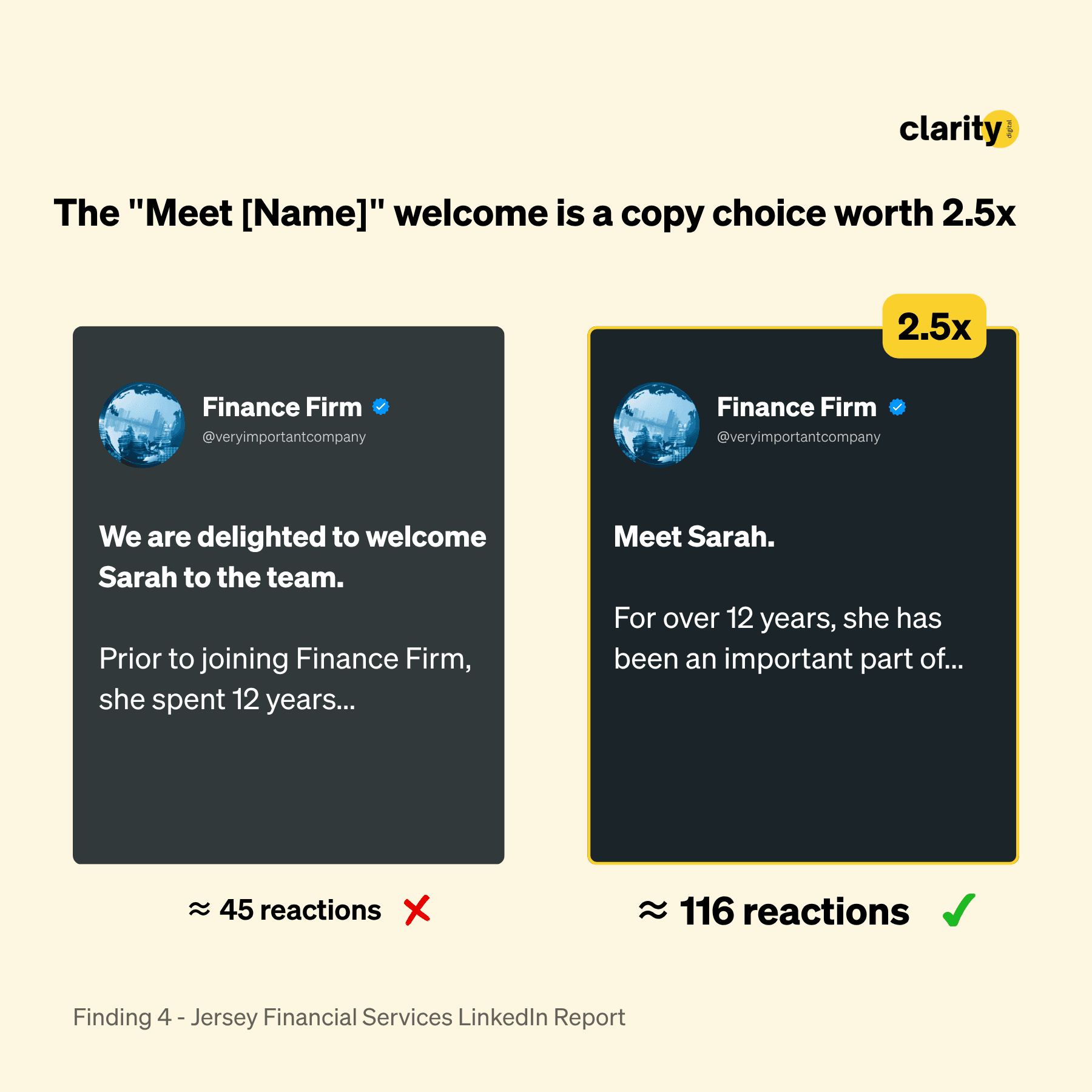
The reason it works is in what each opener does to the reader. "Meet [first name]" invites you in as an equal, as if the author wants two friends to meet. "We are delighted to welcome" just broadcasts, sent out without much thought for who is reading.
The first makes the reader feel a connection. The second feels like watching a pop-up ad.
The sample here is small, ten posts, so treat the exact multiple as directional rather than gospel. But the direction is clear and the format costs nothing. Any firm in this sector could run it on its next new-hire announcement.
Even in B2B, you're always communicating with an individual navigating pressure, responsibility, and complex decisions. When your messaging speaks only to an organisation, it risks feeling distant and impersonal. When it speaks to the person, it resonates. That's why executive profiling and human-led storytelling are so powerful, and why, in our experience, people will always connect more deeply with people than with corporate messaging.

Finding 4: Take thought leadership more seriously
Thought leadership is the lowest-engaging substantive category in this study. It's also the highest-potential one for actual business outcomes, because done right it's ultra-relevant to the few people who matter.
Both are true at once. Business outcomes are impossible to measure here, so treat what follows as an interesting observation about content types and how they engage, not a claim about what wins clients.
Intuitively we all know a birthday post, or an "I'm attending this event" post, isn't going to convince a cold prospect to buy from you. A genuinely thoughtful piece of content might. So read this as a call to take thought leadership more seriously, not to abandon it.
I classified each company-page post by its dominant topic, each post counted once, then looked at engagement by category.
| Topic | n | Mean | Median |
|---|---|---|---|
| Internal promotion | 55 | 135.0 | 62 |
| Welcoming a new hire | 120 | 82.1 | 56 |
| Award or recognition | 61 | 56.1 | 39 |
| Event or webinar | 158 | 43.6 | 26 |
| Hiring or vacancy | 28 | 49.4 | 24 |
| CSR or charity | 86 | 35.6 | 24 |
| Holiday or calendar | 32 | 34.9 | 24 |
| Thought leadership / "insights" | 255 | 44.4 | 22 |
These eight are the substantive categories, and they cover the bulk of company-page posts rather than every one, so the counts don't sum to the full sample. Posts that fit no clear category are left out rather than forced into one.
Thought leadership is the single largest category the sector produces, and the lowest-engaging of the substantive ones. Promotions out-earn it by about 2.8x on the median, welcomes by about 2.5x.
A promotion or a welcome only has to compete with the recipient's own network, people who recognise the name and turn out for it. A thought-leadership post competes with the entire internet for a stranger's attention, and usually loses.
That doesn't mean a regulated firm should flood the feed with people news and give up on substance. Welcomes and promotions are brand hygiene. Take the engagement win when it presents itself. It keeps the firm visible to the people who already follow you.
But the work that can actually move a business usually sits elsewhere: original thinking, clear opinion, a point of view that a buyer can remember later.
And engagement isn't beside the point for thought leadership, even if it was never the goal. The better a piece is, the more people see it, including the handful who might actually matter.
That's the reason to put real time into it. A thought-leadership post should take far longer than a birthday one, and right now the effort often runs the other way.
What actually counts as thought leadership
"Thought leadership" has become a buzzword that means almost nothing, like "innovative" or "purpose-led". To me it really falls into two buckets: original research, or original ideas. Almost none of what the sector posts is either.
Most of it reads like copy-and-paste ChatGPT, "top five reasons to review your trust structure", and lumping that in with the real thing is why the average looks so poor. The filler drags the good stuff down with it.
The better version provides value natively, on the platform, in a way that actually interests the people there, instead of the default "click here to read our blog" that points somewhere else.
Genuine thought leadership, original work with a point of view that can't be copied, is rare enough here that it barely lifts the average. Read the right way, that's the opportunity. The bar in Jersey financial services is low, and almost no one is clearing it on purpose.
Where the effort actually goes
Now widen the lens from how each topic performs to where the sector spends its effort. Set the share of posts each topic represents against the share of engagement it earns back.
| Topic | Share of posts (effort) | Share of engagement (attention) |
|---|---|---|
| Thought leadership | 26% | 25% |
| Events and webinars | 22% | 19% |
| Welcomes | 14% | 16% |
| Promotions | 3% | 8% |
| Announcements | 3% | 5% |
Read the gaps, not the rows. Promotions take up three percent of the sector's output and earn eight percent of its engagement. Announcements, three percent of output for five percent of attention. Both punch roughly two to two-and-a-half times above their weight, and both are among the rarest things any firm posts.
Events and webinars absorb nearly a quarter of all effort and give back less than their share. Thought leadership roughly breaks even, but only because there's so much of it that a few hits carry the rest.
Two things are going on here. The easy wins, promotions and announcements especially, are free wins the sector leaves on the table.
Thought leadership is the opposite. Engagement was never the reason to do it; its real payoff is the business outcomes this study can't see. So thought leadership stays. The job is to make it genuinely good, and to land it in front of an audience the easy wins have already warmed up.
Finding 5: Generic, AI-sounding copy underperforms your own better work
I suspected a lot of that filler was AI-written, or close to it. Whether it literally is or not, I wanted to know whether it actually performs worse.
Not by counting buzzwords - a count of the usual tells, words like "leverage", "robust" and "seamless", turns up nothing. Those words sit in good posts and bad ones alike. What matters is structure: the even one-line rhythm, the tidy setup and payoff, the paragraph that could belong to any firm on any subject.
I had every qualifying post scored from zero to ten for how much it reads like unedited AI. The score doesn't prove provenance: a human can write a post that sounds like AI, an edited AI draft can sound human. What it measures is texture - generic, polished, could-be-any-brand writing.
| How the post reads | n | Median engagement |
|---|---|---|
| Clearly human (0–3) | 482 | 31 |
| Mixed (4–6) | 269 | 27 |
| Reads like AI (7–10) | 159 | 23 |
Read that table carelessly and it says more than it should. Across the whole sector the effect is weaker than it looks: the firms with the largest audiences aren't the ones writing the cleanest posts, a few AI-sounding posts went viral and dragged the averages around, and audience size moves engagement far more than tone does.
Compare firms against each other and it almost washes out.
Measured against a firm's own work
Compare a firm against itself and it gets clearer. Hold the account fixed, same followers, same audience, same length of post, and the ones that read like AI earn about a quarter less than that firm's more human posts.
The pattern holds inside two thirds of the firms in the sample. It's one of the steadier signals in the data and one of the easiest to miss, because it never appears in the league table. It only shows up when a firm is measured against its own better work.
Here is the same data with every firm reset to its own median, so each post is judged against its own account rather than the market.
| How the post reads | Engagement vs the firm's own typical post |
|---|---|
| Clearly human (0–3) | up 7% |
| Mixed (4–6) | level |
| Reads like AI (7–10) | down 15% |
Same firms, same audiences. The only thing that moved is how the writing reads.
Beyond the engagement number
None of this means AI is off-limits. The problem is that the default AI style is now easy to spot all over the feed: smooth, generic and over-polished. AI has made that kind of weak copy cheap to produce, so there's now far more of it about.
Beyond the engagement number, here's what actually bothers me. Posting the chatbot's first draft feels like pollution. It brings down the net benefit of the whole thing: the internet, marketing, storytelling, the real people behind the business.
It feels lazy, and a bit worrying. If a firm will cut this corner in public, it's fair to wonder what else it cuts. Its clients? Its work? Like it or not, your public feed has become a form of due diligence.
And it's a genuine missed opportunity to do something worth reading, because I honestly believe every person in every role has something others are curious about, if only because it's different from their own world. Adding one more AI voice to a feed already full of them, when what people actually want is a human one, feels like a waste of that.
So the topic you choose is only half of it. The other half is whether the writing sounds like a real person.
However a post gets made, the feed rewards a human voice: the posts that read human out-earn the same firm's more generic ones, and the roughly one in six that still read like AI are the ones underperforming.
You don't just want to prompt, you want a repeatable AI content system that you've fed with your best post examples, your tone of voice and an ideal customer profile. Then every draft starts closer to you, but you'll still want to edit it, because it needs to be your voice because that is what your audience reacts best to.

Finding 6: Hashtags, links, length and timing are noise
Several of the things marketing teams spend time optimising turn out not to matter. I'm including them because knowing what to stop doing is as useful as knowing what to start.
Hashtags do nothing measurable. Median engagement is flat across zero, one to two, three to five, and six or more hashtags: 27, 21, 27, 32 respectively. There's no reliable signal in either direction.
External links carry no penalty in this sample. With a link, the median is 27. Without one, the median is 27. The LinkedIn link penalty everyone warns about doesn't show up here.
Length only matters at the very bottom. Posts under 200 characters underperform, on a median of 10. Everything from 200 characters to well past 1,500 clusters around a median in the high 20s to low 30s. A one-line note loses. A short post and a long essay land about the same.
Day of the week is close to flat. Weekday medians sit at 27 to 29. Sunday is normal at 26. Saturday looks genuinely poor at a median of 8, but on only eight posts, so I wouldn't build a rule on it.
None of this is really strategy, it's housekeeping, and the nice thing about housekeeping is that it's free. So stop fiddling with the mechanics. What actually moves the number is the topic and the person behind it.
Finding 7: Video wins, and hardly anyone is posting it
The format of the post changes how it lands, and the sector is clustered in the wrong part of the range.
| Format | Share of posts | Median engagement | Median shares |
|---|---|---|---|
| Video | ~12% | 45 | 4 |
| Image | ~60% | 31 | 2 |
| Carousel / document | ~11% | 26.5 | 3 |
| Text only | ~17% | 12 | 1 |
Video is the strongest format in the simple table, and it wins on the metric that matters most for a firm trying to reach beyond its existing followers. It earns the highest median engagement and the highest amplification: a typical video is shared about twice as often as a typical image.
Shares are the scarce signal on this platform. They are how a post travels past the people who already follow you.
The better test is within firms. Forty-four of the ninety-four accounts posted at least one video. Comparing each firm against itself, and holding post length constant, video came with about a 21% lift in engagement. Not a stone-cold certainty, but a strong enough signal to act on.
And it's under-used. Only about one post in eight here is a video, which leaves it wide open: the strongest format in the table, and the one almost nobody is competing on.
Set the statistics aside and the pull is obvious. Video is the most human way to make content, about as close to a real encounter as you can get on a screen. That's not special to finance: the largest audiences in the world belong to people who make videos, because that's where attention goes. A regulated sector is no exception.
Carousels and the text-only floor
Then the format the sector has been told to prioritise above all others. Carousels, the swipeable PDF documents every LinkedIn adviser pushes, are no better than a plain image in this data: a median of 26.5 against the image's 31.
More slides don't help; longer documents land in the same place. All that production effort, for the result of a single still.
And the floor is text alone. A post with nothing but words earns a median of 12, less than half of anything with an image attached and about a quarter of a video. The earlier point about short posts underperforming is really this one: a bare post, no person and no media, gives the reader nothing to stop for.
The hierarchy is clear enough to act on, even with the caveat. Video performs best and almost nobody is using it. Images are the safe default. Carousels are often more work than they're worth. And a post with no media at all is the weakest thing you can put up.
After putting a person in the post, the next experiment for many firms is putting that person on camera.
The 30-second version
The firms winning the engagement-rate game are small, Jersey-based, and consistent.
| Firm | Followers | Median engagement | Engagement rate | Cadence |
|---|---|---|---|---|
| Jersey firm E | 1,593 | 75 | 4.71% | ~0.5/wk |
| Jersey firm A | ~640 | 24 | 3.82% | low |
| Jersey firm D | 1,591 | 53 | 3.33% | ~0.5/wk |
| Jersey firm B | ~480 | 16 | 3.25% | low |
| Jersey firm C | ~630 | 20 | 3.08% | low |
Underneath the numbers, they all made the same decision. They thought about who was reading and why that person should care, and they wrote peer to peer, not top-down.
The named individual, the first name over the job title, the real photograph over the branded graphic, the warm sentence, the slower cadence: it all comes from that one choice.
The firms the feed ignores are making the opposite choice, usually in one of three ways: generic thought leadership a chatbot could have written, blind promotion, or the same formula we've all seen a thousand times.
The clearest version is the "top five reasons to X" listicle: no specific story from the firm, no data from its own work, no anecdote, just pure copy-paste sameness.
What these posts share is that they treat the feed as a means to an end. Too many say "click here to learn something" where the good ones simply say "here is something". Too many drop a testimonial with no context and hope it carries itself.
There's nothing clever going on here. It's a handful of simple choices, made consistently, by a few firms whose competitors haven't looked closely enough to copy them.
The single strongest signal in the data actually points off the company page. Posts from real people's own profiles roughly doubled engagement.
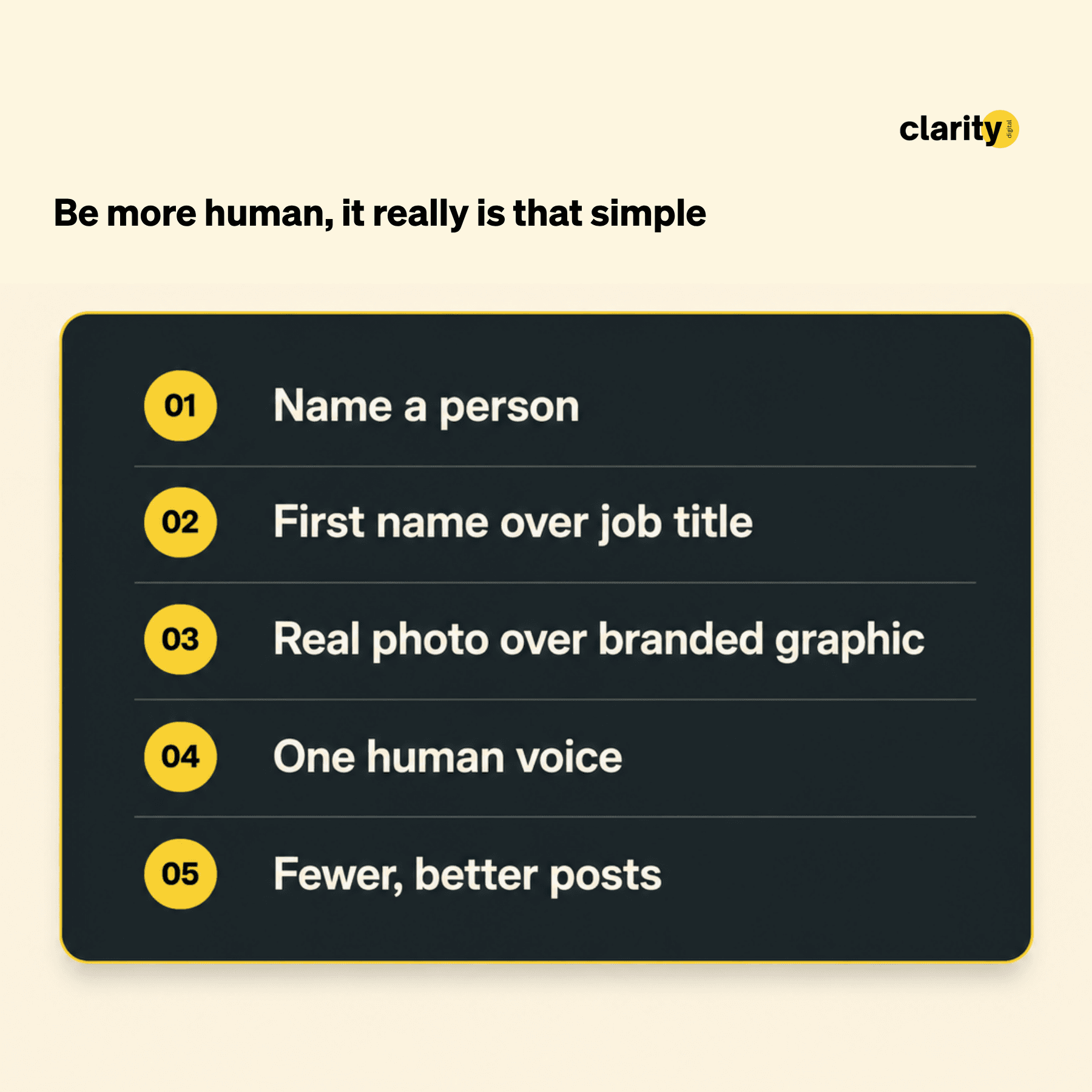
That's the next study, where I'll get into the tactics that live on personal profiles, like tagging people in. But you don't need to wait for it. On your company page, if you do five things, do these:
- Put a real, named person, with their face, in almost every post. Four in ten posts here name no one, and those are the ones the feed ignores.
- Use the "Meet [first name]" format for new hires. It earns about two and a half times the standard welcome, and costs nothing.
- Write like a human, and edit the generic, AI-sounding tone out before anything goes live. Your own human posts out-earn your template-polished ones.
- Take the easy wins. Promotions and announcements punch well above their weight, and almost nobody posts them.
- Test short, human video when the moment suits it. It's under-used here and beats the carousel advice.
Get those right and you have captured most of what the data rewards. Everything after them is fine-tuning, and the data is blunt about how little the fine-tuning moves. So stop spending energy here:
- Carousels as the default answer. In this data they are no better than a plain image, for far more work.
- Hashtags, links, post length and timing. Mostly noise.
- Chasing followers as the main scorecard. The biggest audiences convert the fewest of them.
- Posting more often for its own sake. Once you account for size, frequency doesn't move the number cleanly.
Strip the whole report down and it's not really about LinkedIn tactics. It's about whether a post was written from a real point of view, by a person, for a reader they'd actually thought about, or whether it was assembled to fill a slot.
Write the first kind and you earn the reply. Write the second and you get a like, if you're lucky.
What the data is actually saying
The first report described a sector whose websites were built for people who already knew the firm. The LinkedIn data says the same thing in a different place.
Most firms here post the way you'd write an internal update: for colleagues, for peers at adjacent firms, for clients glad to see a familiar name in the feed. That audience is real, and it's part of how these accounts grew their followings in the first place.
But the person who decides whether your firm is worth a first conversation, the settlor, the corporate counsel weighing a structure, the wealth manager looking for a referral partner, doesn't know you yet. They're scrolling against their own colleagues, their own clients, and the rest of the financial internet, and they're the audience most of this content never reaches.
The firms that do reach them aren't doing anything exotic. They write about people with first names, use photographs of actual humans, post less often and with more care, and a few have started putting themselves on camera, where the attention and the sharing run highest.
The first report closed by saying most of these businesses are considerably better than their marketing suggests. The LinkedIn data says it again, in a tighter frame: the quality of the firms isn't in question. Whether any of it reaches the people who don't already know them is.
LinkedIn doesn't have to look like this
Most firms treat LinkedIn as a chore, or a risk, or something to be got through. Usually the pain is the back and forth: the small edits, the second-guessing over whether it's the right voice, the hours poured into carousels and polished visuals.
But the levers that actually work in this data are the opposite of all that. They're about authenticity, not production. The posts that won here weren't the most polished. They were the ones that sounded like a real person with something worth saying, and that version is lighter to make, not heavier.
This study is also what pushed me to build the thing I'm now testing. The insight worth reading already sits in the people who run the business. Getting it onto the page in their own voice takes a good interviewer more than a good writer.
That's Clarity Voice. You turn up to a 45-minute interview and leave with one to four weeks of posts, built from what you actually said. The expertise is already in the firm. The job is just to get it out, without making anyone become a writer.
And if it would help to see your own numbers first, I'll run a short version of this analysis on your firm's LinkedIn for free. Email me the page and I'll send back what it shows.
Questions Jersey firms ask about LinkedIn
These are sector-wide patterns, useful for generating hypotheses to test against your own results. Where your own numbers disagree, they win.
How often should we post? Less often than most planning assumes, and the number matters less than the planning suggests. Once you account for firm size, there's no clean signal that posting more, or less, changes how a firm does for the audience it has. The firms posting many times a week are mostly the global brands, and per follower they're the worst performers in the sample. So the honest answer isn't a frequency, it's a standard: post when you have a named person, a real moment or a genuine thought, and skip the weeks you don't. The winners here post around once a fortnight and pick their moments.
When is the best time or day to post? It barely moves the number. Weekday medians sit close together, Sunday is normal, and only Saturday looks genuinely poor, on too few posts to trust. Pick a slot that lets you reply to comments in the first hour, and stop optimising the clock.
Will an external link kill our reach? Not in this data. Posts with a link earn the same median as posts without one. The much-repeated LinkedIn link penalty doesn't show up here. Put the link where it's useful to the reader.
Do hashtags help? No measurable effect, in any quantity. Use one if it genuinely belongs, and ignore them otherwise.
Should we be making carousels? You really don't need to feel you have to, especially if you've tried them and they haven't done what you hoped. Across this sample they performed no better than a single image, for a lot more work. If your own numbers say otherwise, trust those first. But if you're pouring time into carousels with little to show for it, a short video is usually the better bet.
Our following is small. Is LinkedIn worth the effort? More worth it than a large following, oddly. A small, warm audience converts a far higher share of itself than a large, inert one. The 600-follower firm on the right format out-engages the global brand per follower by several hundred times. Size is not the constraint. What you post is.
The methodology
This audit examined 1,036 LinkedIn posts from 94 accounts active in or around Jersey's financial services market: trust, fund administration, fiduciary services, family office, multi-jurisdictional law, and accounting.
The sample includes most of the 28 firms from the previous report, their Channel Islands and Crown Dependency peers, several global firms with relevant operations, and a small number of individual practitioners. The large international firms were included deliberately as a comparison set; the followers-trap finding depends on holding them against the small Jersey firms.
For each account, up to the 20 most recent posts were collected. Engagement is defined as likes plus comments, and that definition holds everywhere in the report except where shares are named explicitly. Views are empty in the data and cannot be measured.
Posts were classified by topic using a mutually-exclusive keyword classifier: each post counted once, under its first-matching category. The per-post topic medians in Finding 4 cover company-page posts; the effort-versus-attention shares in the same finding cover all 1,036 posts, which is why the two tables are not directly comparable row for row.
Posting cadence is reported only as context, not as a finding of its own.
An earlier cut of this report ran a cadence-versus-engagement table, but the relationship turned out to be almost entirely a firm-size artefact: the high-cadence bucket is dominated by global brands posting many times a week to enormous, inert audiences, which are the worst performers per follower in the whole sample. Once size is accounted for, there's no clean evidence that posting more or less changes how a given firm does for the audience it has.
Engagement rate is median post engagement divided by follower count, a crude but standard proxy, with follower counts as self-reported by the platform. This is useful for comparing how strongly an audience responds, but it shouldn't be read as proof that every reaction came from a commercially relevant person. Proving that would require a separate commenter/reactor identity study.
Finding 2 (person versus logo) rests on just 24 posts from personal profiles, the thinnest cut in the report. I checked whether the gap was really about content type rather than who posted, by comparing like-for-like content, and profiles still came out ahead. But 24 posts can't settle it. Treat it as a strong signal, not proof, and the reason a dedicated personal-profile study comes next.
Finding 5's AI-likeness scores were produced by having a language model rate each post from zero to ten on how much it reads like unedited AI, judging structure and texture rather than keywords. The measured variable is perceived AI-like texture: generic, polished, could-be-any-brand copy. It doesn't prove literal AI provenance.
I measured the effect within each firm, comparing a firm's posts against its own others, so audience size and sector are held constant. A keyword-only version of the same test found nothing, which is why the texture rating was used instead.
Finding 7 classifies each post by what it carries, taken from the full export: video if it has an attached video, carousel if it has a multi-page document, image if it has a still, text if it has none of these.
The within-firm video check covers the 44 accounts that posted at least one video. Native video comes out positive, but only weakly once you account for the fact that a handful of firms drive much of the effect, so the report frames it as a useful experiment rather than a settled result.
Two samples are small and should be read as strong directional signals rather than proof: personal profiles in Finding 2, and the "Meet [first name]" format in Finding 3. Both warrant a larger targeted pull before anyone builds a campaign on them.
Firm-level figures in this report are anonymised.