
Jersey has a fun way of doing business.
Nine times out of ten, we don't rely on ads, funnels, or aggressive sales tactics.
We hire people we trust. A recommendation, an ex-colleague, a friend-of-a-friend.
But there's one moment we often forget.
Before someone calls you, they Google you.
And in those first 10 seconds, your website is silently telling them a story.
We need to ask ourselves: Is it telling the right one?
Let's break down what your website might be saying behind your back - and how to fix it fast.
1) Nice Jersey photo… but who are you?

Iconic lighthouse. Zero information.
First impressions matter.
- Scruffy clothes = lazy
- Bad breath = careless
- Showing up late = unreliable
And a homepage full of Jersey stock photos? Cold. Distant. Non-commital.
At best, it looks like the web designer's placeholder was never swapped out.
Or worse, it's the business equivalent of printing someone else's bio on your letterhead. A missed moment to show people exactly who they'd be working with.
Here's what your images should be instead:
- You and your team
- Your real work
- Your customers (if possible)
People trust what they can see - give them something real, and they'll feel far more confident picking up the phone.
2) No social proof? I'll take my chances elsewhere.
Amazon, Shopify, Temu… what do they all obsess over?
Reviews.
Billions in data all point to the same thing:
Your business isn't any different. We trust what others trust - and we distrust what nobody seems to vouch for.
And no, an old "Testimonials" page isn't enough. Social proof should work like salt - sprinkled evenly throughout the whole dish, not dumped in one corner.
Use things like:
- Testimonials
- Awards
- Logos
- Numbers served
Worried your proof isn't "perfect"? Share it anyway. Most people skim. They won't interrogate it.
Where to put it:
Many websites treat testimonials like a storage problem - everything gets pushed onto a single page and left there. But users don't read websites that way. They scan. They look for quick signals of trust. A single, well-placed testimonial can outsell an entire page full of them. Users scan for relevance, so pairing the right quote with the right service always beats a distant wall of reviews.

3) Have you answered my question?
Every visitor falls into one of two camps:
- They already know they need you
- They're not sure yet
Both have questions.
If your site doesn't answer them quickly, they drift.
Common questions people want answered
| Qualified customers | Unqualified customers |
|---|---|
| What makes you different from others? | Do I really need this service? |
| Are we a good fit? | What is the cost of NOT doing it? |
| What can I expect if I reach out? | What can I expect if I reach out? |
Answering these questions will make people feel comfortable. And, as a bonus, will get Google and AI systems talking about you.
4) Walls of text = you don't value my time.
If someone lands on your site after an evening of scrolling Instagram, the last thing they're reading is a chunky paragraph.
It may as well be written in Japanese.
They feel like you made their life harder.
Instead, break things up:
- Short lines
- List
- Images
- Quotes
- Data points
Aim for this: no screen on your site should be screenshot-able without some visual variety.
Luckily, this fix is instant - add spacing, add visuals, and your whole site feels friendlier.
5) Industry jargon = you're just like everybody else.
Scan your site.
If you spot three or more of these, it's a red flag:
| Cutting-edge | Best-in-class | Seamless | Trusted advisor |
|---|---|---|---|
| Client-focused | Future-proof | Dynamic | Proven solutions |
| Innovative | Market-leading | Integrated | Excellence / delivering excellence |
| Bespoke solutions | End-to-end | Strategic partner | Empower / empowering clients |
| Tailored approach | Holistic | Results-driven | Partner-led |
These words have been used so often they've lost meaning. And every second someone spends on your site is precious - don't waste it with white noise.
Ready to unlock a bespoke, client-centric, best-in-class marketing transformation? At Clarity Digital, we take a holistic, end-to-end, future-proof approach to delivering seamless, integrated solutions that empower your business and drive excellence across every strategic touchpoint. Book a call.
6) No faces? Who am I even hiring?
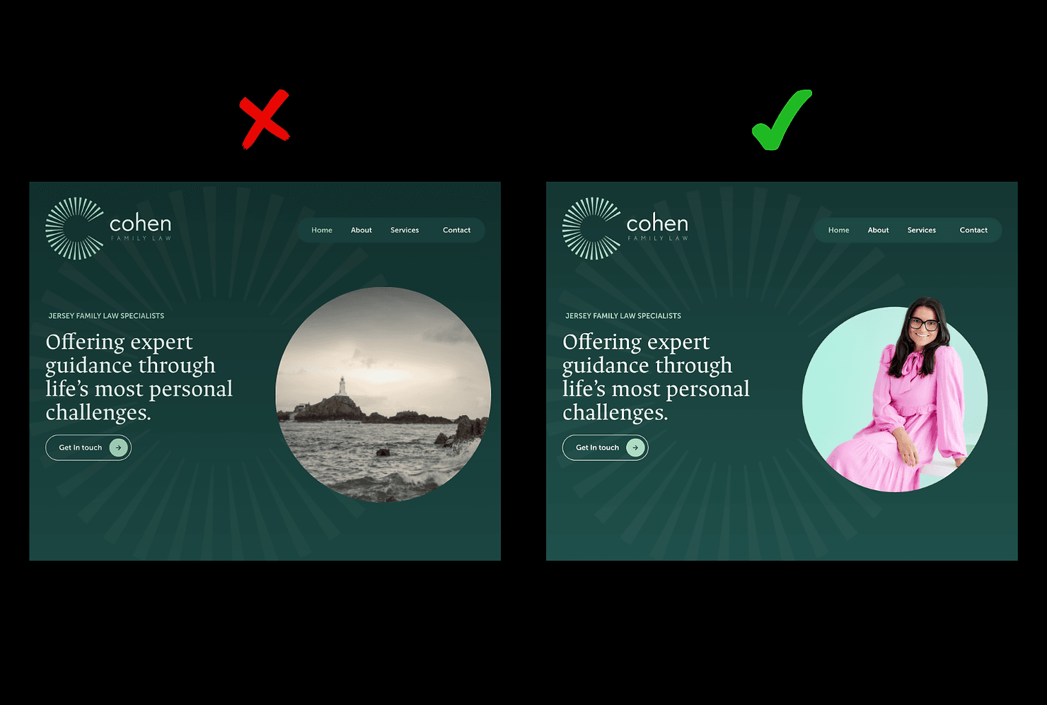
Cohen Family Law - a great example of local branding.
People don't hire "a business". They hire people.
If your site doesn't show your face, your team, or your actual workspace, then visitors have to guess who they'd be talking to. The more you show, the less they guess - and the more human you feel.
Great places for photos:
- A clean headshot on the homepage
- A "meet your team" strip
- Real workspaces
- A relaxed photo on your About page
Faces turn a business from "a website" into "a real human I could actually work with".
7) The 80/20.
At the end of the day, your website doesn't need to be loud, clever, or complicated. It just needs to reflect who you are, answer people's questions, and make it easy for them to trust you. Fix a few small things - the photos, the wording, the layout, the proof - and the whole experience suddenly feels more human.
And when your site feels human, people feel comfortable reaching out. Which is the whole point, right?
If you'd like to know what your website is actually communicating to the clients you want most, the Clarity Reset starts there.
James Logue is the founder of Clarity Digital, a strategic marketing consultancy based in Jersey that helps professional services firms bring their external presence up to the standard of the business behind it.