_edited_p.png)
If It Doesn’t Sell, It’s Just Expensive Art: The Chaos of Modern Marketing
- James Logue

- Jun 16, 2025
- 2 min read
Updated: Sep 22, 2025
Modern marketing is full of smoke and mirrors.
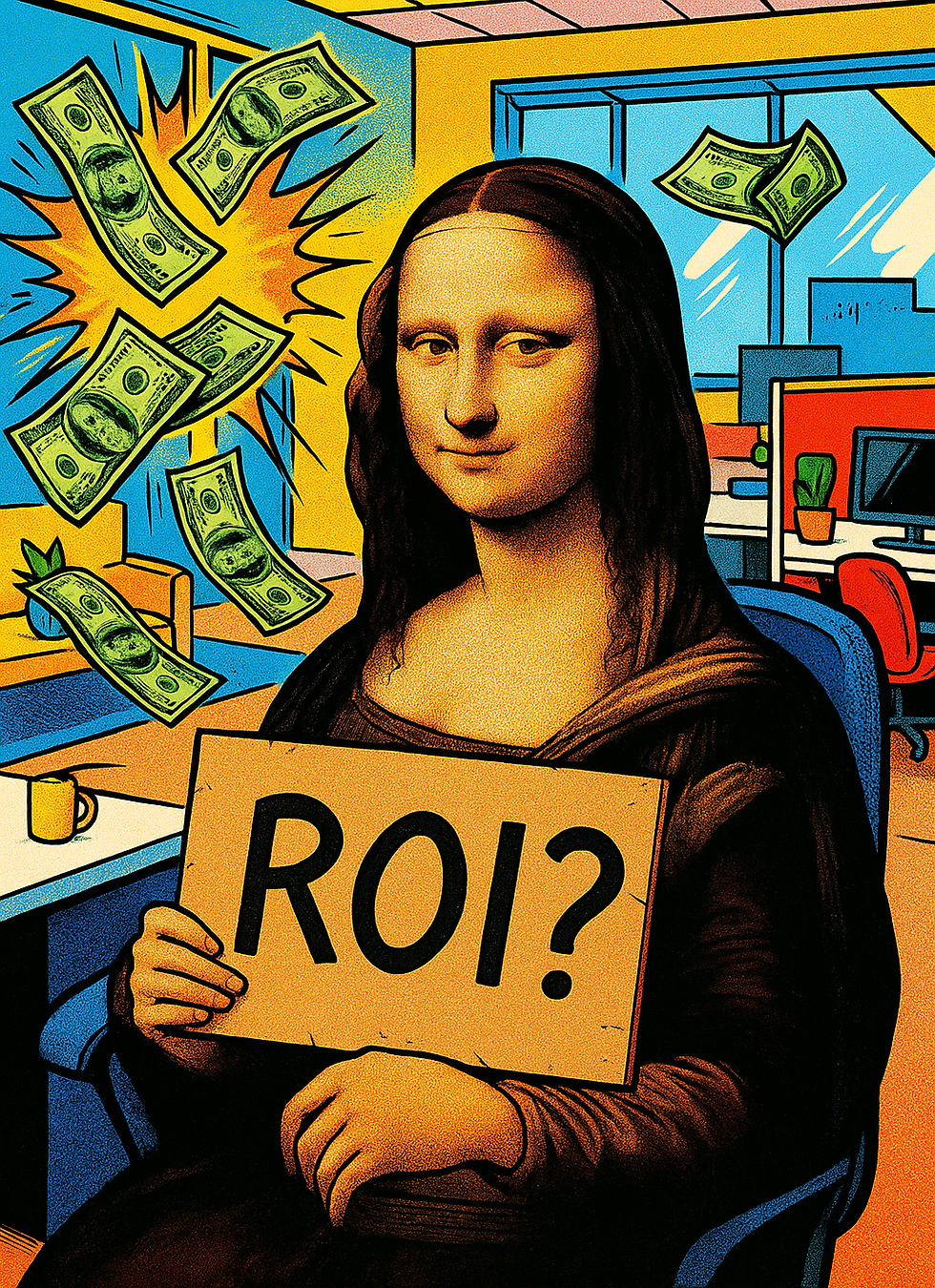
Nice colours. Clever slogans. Reports packed with charts and numbers that look impressive… until someone asks:
“Cool — but did we actually make any money?”
More often than not, the answer is: no idea.
Marketing isn’t broken. It’s just chaotic.

Most businesses don’t need more content. Or more ads. Or more tools.
They need clarity.
What we see all the time is this:
Teams using 5 different tools that don’t talk to each other
Agencies pushing SEO, PPC or “brand awareness” before understanding the business
Internal marketers scrambling to prove ROI but chasing vanity metrics instead
And it’s not their fault. There’s just no plan. No north star. Just activity.
And when there’s no clear strategy, you end up with expensive art.
It looks good. It ticks the boxes. But it doesn’t convert. It doesn’t scale. It doesn’t work.
Pretty won’t pay the bills.

Design matters - absolutely. That's why we have designers in the team. But if your campaigns aren’t tied directly to growth, it’s just noise.
We’ve seen beautifully branded campaigns generate 0 leads. And we’ve seen ugly, scrappy landing pages bring in real revenue because they were aimed at the right people, with the right message, at the right time.
This is the shift more businesses need to make:
From how it looks, to what it does.
So what does real marketing look like?

It’s not complicated. In fact, simple usually wins. At Clarity, we follow the same structure for every client:
Audit – What’s working, what’s not, and where you’re wasting money
Roadmap – A simple, focused plan that fits your budget and goals
Launch – We execute, track, and optimise every pound spent
No fluff. No bloated retainers. No tactics for the sake of it.
How to spot “expensive art” in your own marketing
Ask yourself these three questions:
Are we actually tracking the right metrics - or just whatever the platform shows us?
Do we know which activity drives real revenue?
If we turned everything off tomorrow, would we know what to turn back on first?
If the answers make you hesitate - that’s a sign.
You don’t need more content. You need clarity.
If you’re a business in Jersey (or anywhere, really), and you’re tired of guessing - we can help.
Let’s look at your current marketing, cut the fluff, and build something that actually works. No jargon. No BS. Just smart strategy that brings in more of the right customers.
-James
------------------

James Logue is a Jersey-based marketer with 10+ years’ international experience leading marketing for SMEs. He runs Clarity Digital, helping businesses become the brand AI mentions first. Updated: 22 September 2025.